Wednesday, 1 February 2012

Target Audience 


I am producing a gangster film, the film itself ill be set in New York I think it will appeal to the following people: 


Live: Ghetto streets of America cities like New York (Brooklyn), LA, Detroit 
Age: 15 and over 
Gender: Male
Social Economics: Lower and Middle class
Jobs: Minimum wage jobs or no job at all
Education: Low level of education left after school or college
Interests: Computer games sports chilling with friends 
Favorite films: Get Rich or Die Trying, Notorious, Menace II Society, Boyz N the Hood, Scarface
Favourite music genre: Rap and Hip Hop 


My Films Age Rating

I decided that my films would be rated a 15, because my film will contain drugs,  strong language violence. My film would be unsuitable for children under 15 to watch. My film wouldn't be a 12A or 12 because it contains drugs and a lot of strong language at 12 there can only be a bit of bad language. My film won't be needing a 18 the reason for that is there is no nudity and sex in this film so the perfect age rating for my film would be 15.


Film Classification 


The U symbol stands for Universal, it is suitable for audiences aged four and over.


The PG symbol stands for parental guidance . These films are suitable for general viewing, some scenes may be unsuitable for young children. A PG should not disturb children aged 8 or over. 


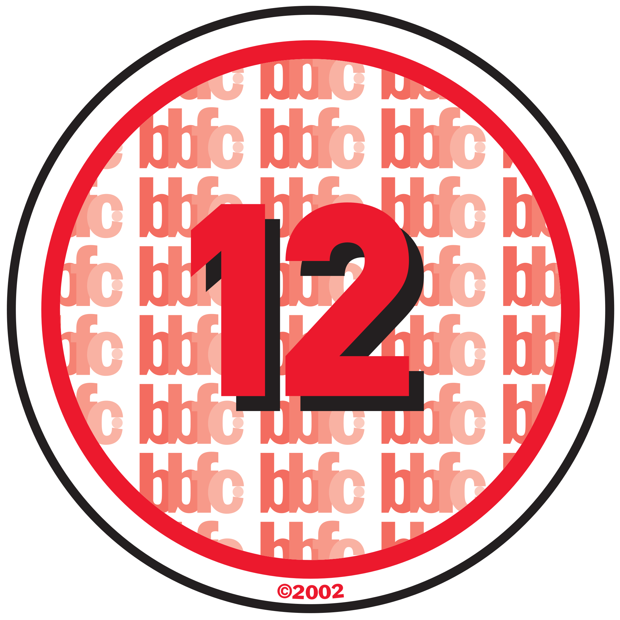
The 12 symbol means that audiences 12 and over can watch the film. The A in the 12A stands for accompanied and advisory people under 12 must be accompanied by an adult. 


The 15 symbol means that audiences 15 and over can watch the film.The main issues with 15's are strong language, portrayals of sexual activity, strong verbal references to sex, sexual nudity, discriminatory language or behaviour and drug taking .


This is the 20th Centry Fox ident this is another big production company. The ident has bold writing on it saying 20th century fox it has dramatic music playing in the background which starts at the begining 1 second and fades out just before the end of the ident at 21 seconds. The ident has lights on it which makes you think of films when your in the spotlight.


The things I like about this ident is its very big and bold it has the gold colour which makes it look important I like the lighting effect used and the music used.


I started to research film idents to see what different ones look like and whats good or bad about them. I did this so I could get an idea of how I wanted my ident to look.


This is the famous Warner Brothers Ident, It starts off with some houses this could to show to produce films for families. It then spins and turns into a big logo which says WB which stands for Warner bros
There is music playing in the background of the ident which starts off at 2 seconds and then at 5 seconds it becomes louder and more dramatic then fades out at the end of the ident at 12 seconds.


I like this ident I like how it starts off as some buildings/houses and then transforms into a big shield which holds the two letters off the logo. I also like the gold colour used it makes the actual logo seem very big bold and important and also I like how its in the clouds which also makes it look like a big production company and better than the rest.